Saturday, 18 February 2012
Music Soundtrack
Over the last few days my group and I have been looking into our music sountrack, using 'Audio Network'. We used the same website last year for our media product and found that it was a good, simple website to use. We feel that this track goes well with our footage and creates the tense, horror atmosphere we are trying to create. We will use Adobe Premiere to upload the soundtrack and then it will be played all throughout the soundtrack, starting during the Paramount logo.
Wednesday, 15 February 2012
The Uninvited- Poster Research

- The font stands out against the black background as it's bold and white. My group and I will be using a similar font and background colour scheme as this is similar to what we used in out trailer for the titles.
- The black and white image ensures focus on the text but also the subject of the image. Black and white film posters can usually give away the genre of the film, usually being a horror film.
- The type of image that is used, faceless person, gives a mysterious feeling to the audience by how the image is shown (person looking through the window)
Tuesday, 14 February 2012
Valentine- Poster Research
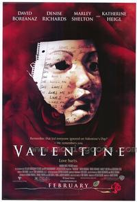
- The use of red for the background colour indicates danger and stands out bright and clear to the viewes
- The use of white writing throughout the poster and in capital letters 'VALENTINE' under the main image and stands out clearly against the red background and idicates some sort of romance
- The main image on the poster shows a scary figure, possibly being a mask of a young child
- At the bottom of the poster, the month as to when the film will be released is shown however, it is not giving the exact date as to when the film will be out in cinemas. This is a feature which my group and I will be using in our own film poster
Sunday, 12 February 2012
One Missed Call- Poster Research

- Dark background which means the image, font, colour of the writing (white and red) on the poster stands out to draw the audiences eye
- A quote is quoted at the top of the poster to entice the viewers in, by which is makes the audience more interested in the film. They are being persuaded to watch the film and also by the use of red that is used, indicates danger
- The strange and horrific image on the front of the poster indicates that the person is wearing a mask which ticks of the stereotypical conventions of a horror film
Saturday, 11 February 2012
Let Me in- Poster Research

- The poster consists of ice as the background which gives a feeling of innocence to the audience and black letters in capital letters for the writing, also having the word 'ME' in blood staines which catches the audience's eye instantly which means danger, the red also stands out a lot more when it is up against a white background
- The poster doesn't contain too much information about the film compared to other film posters that I have analysed, only the director is produced onto the poster, this could mean that the poster had been released early when they were still in the progress of making the film or could mean that they did not want to unvail too much information about the film, this may be a convention we may consider for our own poster
Paranormal Activity (research)

- The poster contains red font infront of a black background, by which it gives a feeling of danger which is shown throughout this film
- The image across the middle of the poster has been edited to tinted blue, also showing the main convention of this film is that it's filmed on a home video camera, which gives the film a more realistic approach
- At the top of poster there are quotations to make the viewers become more interested in the film, also by having quotations on a poster it informs the viewer that this film is worth seeing
- 'In Cinemas November 25' is indicated in white at the bottom of the poster, the rest of the writing is in red, however this stands out from all the other writing because it is clear and shows to the audience when the film will be released to watch, this is a good feature to have on a poster
Friday, 10 February 2012
Film Magazine- Empire Title
As my group and I have decided to use empire magazine to have our film shown on, I decided to research into the different empire front covers of films to see how the 'EMPIRE' logo is positioned.

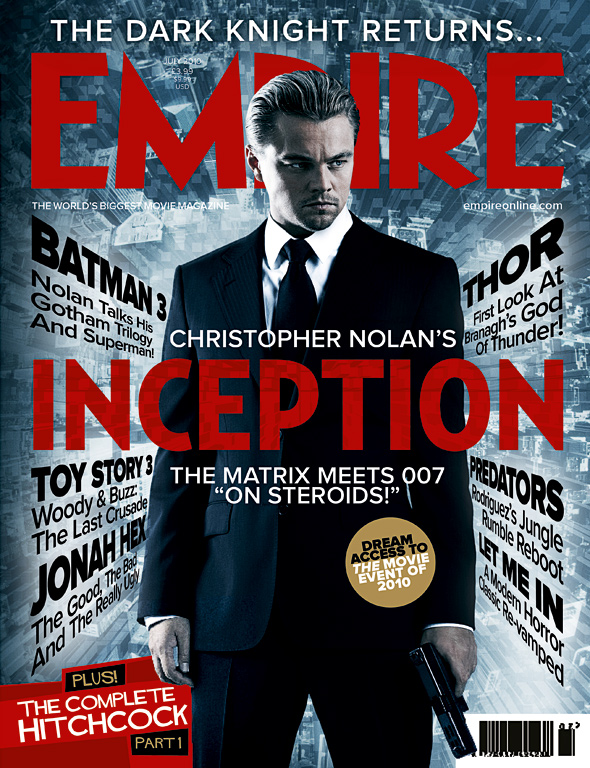

The different film magazine covers above show how the 'EMPIRE' logo is positioned. I have managed to find in photoshop the Magic wand tool, whereby you can select each letter individually and then add it to a film magazine front cover. This is something I will keep in mind, in which i may use on my own magazine front cover. As my group and I aren't too sure where we will be placing the 'EMPIRE' logo yet, it all depends on the image that we will have on the front cover.
The different film magazine covers above show how the 'EMPIRE' logo is positioned. I have managed to find in photoshop the Magic wand tool, whereby you can select each letter individually and then add it to a film magazine front cover. This is something I will keep in mind, in which i may use on my own magazine front cover. As my group and I aren't too sure where we will be placing the 'EMPIRE' logo yet, it all depends on the image that we will have on the front cover.
Sunday, 5 February 2012
Empire Magazine
Here I have looked at the empire film magazine, as this is the magazine we want to have our film shown on. This magazine looks at the big block buster films that are released, below I have looked at some of the eye catching covers that I think are really effective front covers for catching the audience's eye. By looking at these different magazine covers there are some obvious conventions (simple image, font colour matching image and font titles in the trailer).


Saturday, 4 February 2012


Friday, 3 February 2012
Research and Planning- Film Titles


Font used: Adobe Garamond Pro
Colour: White
Style: Bold Italic
Style: Bold Italic
Text Size: 120
Above I have displayed practice film titles for our film. These were created using Adobe Premiere, whereby I have added a black background with white writing in capital letters over the top, which can be compared to the film 'Valentine' trailer titles. The theme represents the genre of the film, horror/romance. We will be using something very similar to this for our teaser trailer. Below I have displayed an example of a film title from the film valentine:

Thursday, 2 February 2012
FILMING DIARY
oday my group and I went to the woods to do our second lot of filming for our teaser trailer. We hadn't been able to film for a few weeks before today because we had to find a camera that was available to use and also that everyone is able to attend. We managed to do shots in the woods, of high angles and long shots. Even though most horror films happen at night, we have filmed during the day in Oxshott woods, by setting our location in the woods we have been able to give a horror feel to the scene which is what we were hoping to do.
My group and I have found that as we are doing a teaser trailer this year as opposed to a two minute opening of a film, we need lots of shots that we are able to edit altogether as opposed to making long shots. We have found that within some shots we need only 2-5 words in a shot instead of long dialogue conversation. By making a teaser trailer, it has made my group and I realise that by going by our shot list, script and story board it is going to be fairly difficult as we didn't quite realise how many shots we are going to need need to make it a realistic teaser trailer. So far we haven't managed to stick to the story/shot list as much as we hoped however, this does not matter too much as we are making a teaser trailer that doesn't need to tell too much of a story.
Below I have added some of the location shots from todays filming;
Subscribe to:
Posts (Atom)